ConvertPlus offers a Real-Time Live Editor that allows you to Customize every element in a module. It has an easy-to-use interface that makes the process quite simple.
The best part of editing an element on a module is by clicking it on the preview form. You will see the Option open in the Dashboard.
The following walk through is made to show you how you can go about formatting the basic elements on the Modal.
1. Changing the Font Style on the Module
You can change the Font style for all the elements in the form. You simply need to click on the text that you wish to change. You will then see the bar like the one seen in the image below.
i. You can change the font style, the size, alignment, etc using the bar here.
ii. For areas where such a background is place behind a piece of text, you can change the background color and its opacity too!
2. Working with the Form Builder
ConvertPlus comes with a form builder that lets you add or delete form fields. You’ll form the form builder under Design -> Form Builder.
The Form Builder lets you add fields, manage the layout and form styling through this.
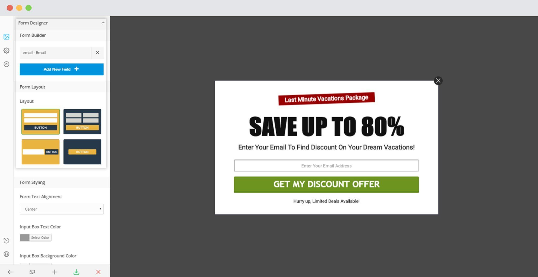
You can refer to the article here to know more about the Form Builder.
3. Formatting the Image on the Modal
ConvertPlus allows you to upload an image of any size or dimension. You can click on the image in the default Module and the options for Modal Image will appear in the Dashboard. You can also go there by “Clicking on Modal Design -> Modal Image”
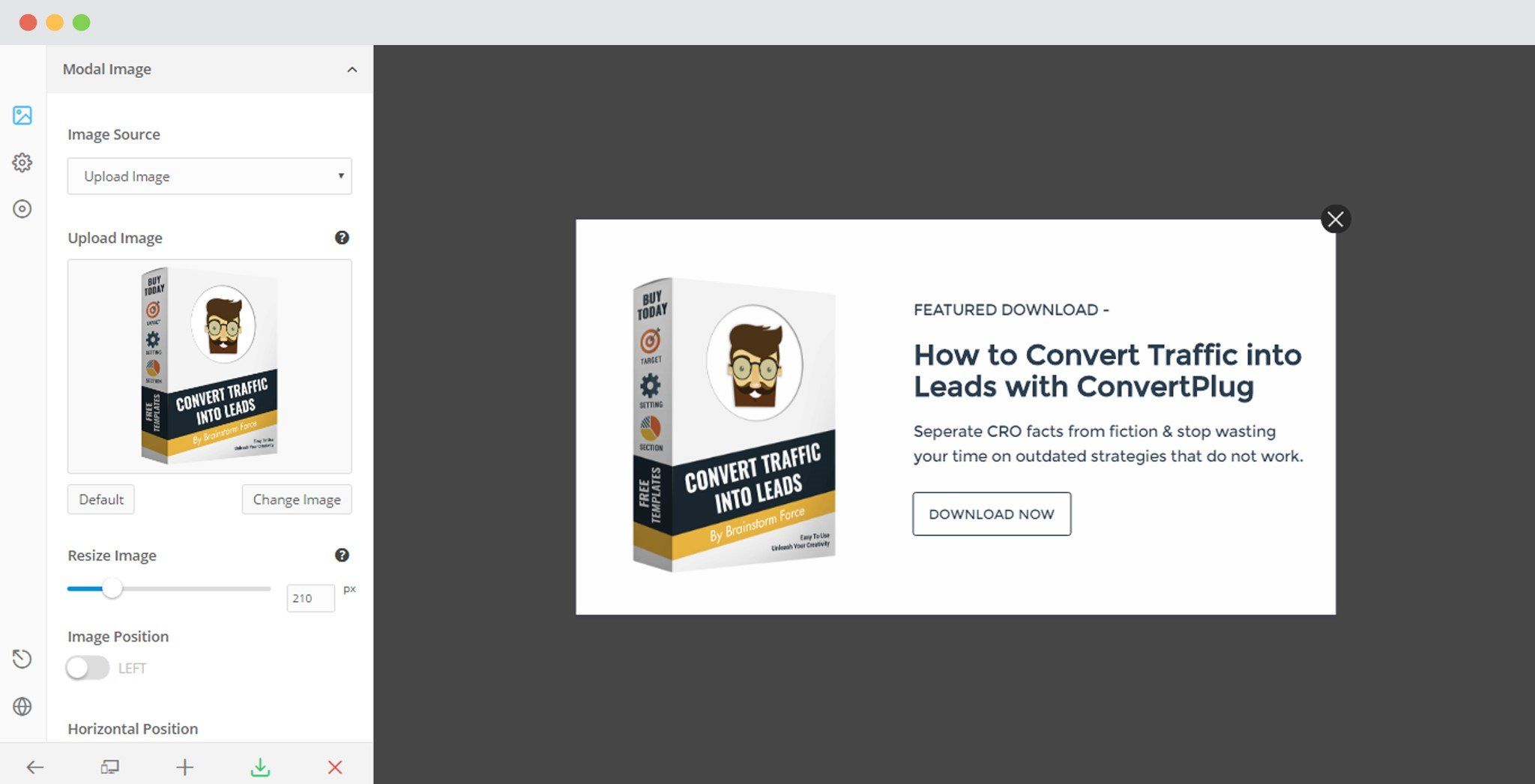
- Upload an image: Allows you to upload an image of any dimension.
- Resize the Image: Allows you to resize the uploaded image to suit the overall modal design.
- Placement of the image: Allows you to move the image to the left of the modal or keep it as it is. You can move the image horizontally or vertically too.
- Show/Hide Image on Small Screen: Allows you to decide whether you wish to display the image on smaller screens.
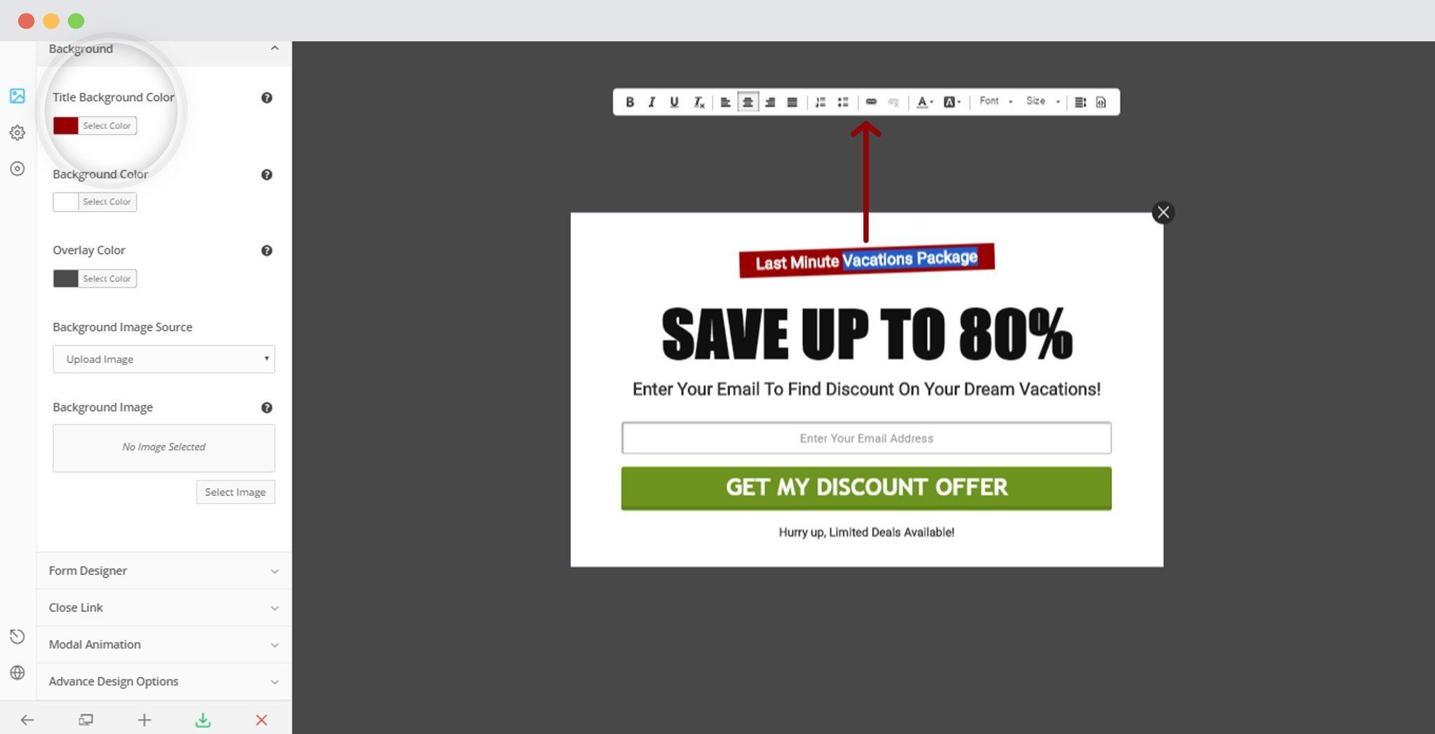
4. Module Background
ConvertPlus allows you to change the Background color within the Module and the Overlay Color too. In order to give you a little more freedom on changing the look of your modules, you can also add an image to the background. Apart from simply clicking on the background area of the modal or the overlay, you can make changes by “Clicking on Modal Design -> Background”
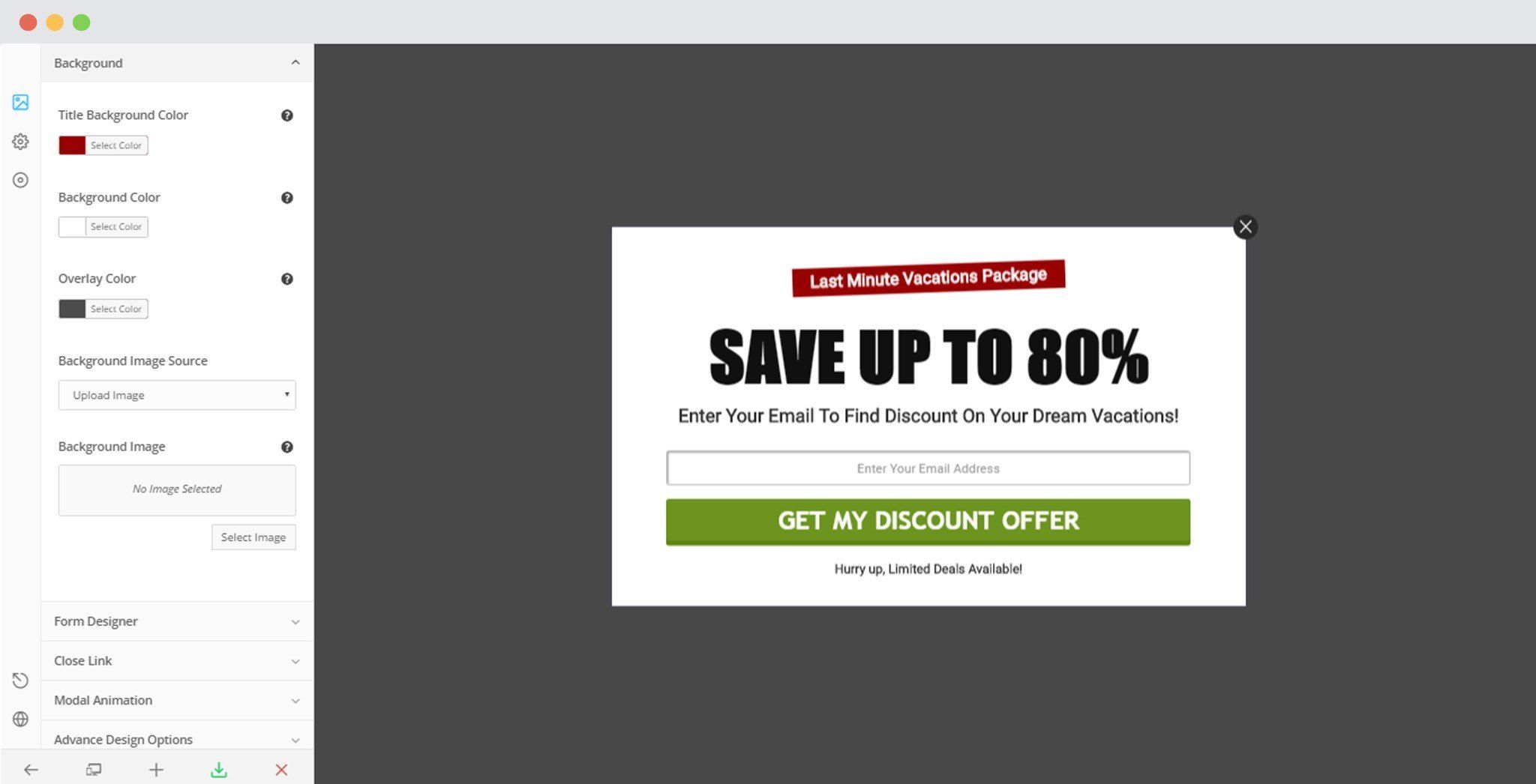
- Background Color: Select a color from a huge collection seen when you click on the block.
- Overlay Color: Select a color from the given set of colors seen when you click the block.
- Background Image: Select a method you wish to import the image. You can add a custom URL or upload an image too.
- Image Size: This feature allows you to change the size of the image. You can select Full, Thumbnail, Medium, Large or Post Thumbnail.
- Background Repeat: You can select Repeat, No Repeat, Y Repeat or X Repeat.
- Background Position: It allows you to change the Background Position. You can either select left, right or center.
- Background Size: This feature gives you options to select Cover, Contain or Default as the Background Size.
5. Formatting the Close Button
Every little formatting aspect of a module will affect the conversion rate some way or the other.
ConvertPlus allows you to change the position of the close button, change the button style with an option to decide whether you wish to display a close button.
Click on the Close Button to view tab in the dashboard. Or, you can make changes by “Clicking on Design -> Close Link”
 Image/Text/Hide Button: ConvertPlus allows you to change the Type of Close button. i.e you can decide whether you want text or an image.
If you select an Image type, you can upload the desired image in place of the close button. Apart from the text or image option, you can also decide whether you wish to display a close button or no. Not displaying a close button can compel your users to perform the required action before they go ahead.- Position: You can change the position of the close button. ConvertPlus allows you to place the button Outside (in the overlay), adjacent to the modal, or even remove the Close option.
- Close Button Text: ConvertPlus allows you to edit the text that will be seen on the Close button.
- Close Button Text Color: You can edit the Text color of the “text” you enter in the button.
- Close Button background color: This option can be seen only when you select the position of the Close button as “Adjacent to the Modal”.
- Options to close the Modal: This allows you to set how you wish to let the users close the modal. There are two options here. Decide whether one should click only on the close button or whether it is fine if one clicks on the Close button and the overlay.
- Display/ Hide Tooltip: A Tooltip is a set of text that will appear when the user hovers over the Close button. If you select, display, you are also given a choice to change the tooltip text.
- Tooltip Text Color: If you decide to display a tooltip, you can set the text color too.
- Tooltip Background Color: With the text color, ConvertPlus allows you to select an appropriate background color for the tooltip background.
- Display Close after few Seconds: This option lets you display the close button or link after a particular time period.
- Autoclose Module: This option closes the module automatically when it tracks user inactivity for the specified time period.
6. Modifying a Modal popup size
You can modify the size of the modal by going to the “Advanced Design Options”.
Design -> Advanced Design Options
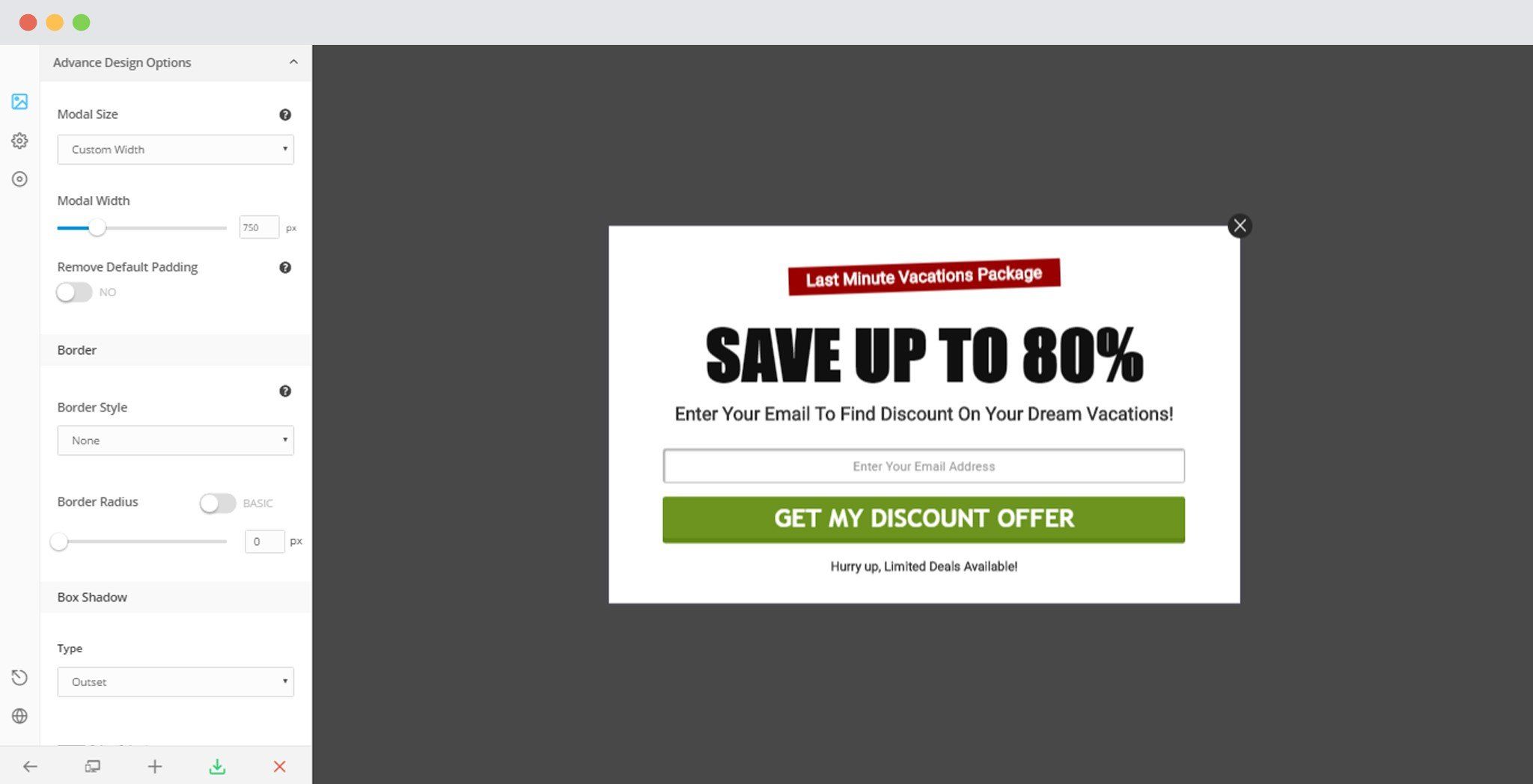
You can select whether you want a modal that is spread across the screen or whether you wish to customize the size too.
- If you select a Custom width in the above Drop down list, you then have an option to select a suitable width for your modal.
- You also have an option whether you wish to keep or remove the padding on the modal.
7. Changing the Border Style of the Modal
ConvertPlus allows you to change the Border style, width, and the color too. You can do so by clicking on “Design -> Advanced Design Options”
 Border Style: You can select an appropriate border style for your modal.
- Border Color: This option allows you to change the border color as per the design and theme you wish to follow.
- Border Width: You can change the width or the thickness of the border. There are two factors in this; the basic and the advanced. The basic allows you to change the border width equally on all sides. Whereas, the advanced option allows you to change the border width individually for all sides.
- Border Radius: This option allows you to change the radius of the modal. You can turn the sharp corners of a modal into rounded ones. Like the Border width, the Border Radius too has two separate factors. If you wish to change the Radius of all the corners equally, you can move on with the basic option. But, if you wish to change the border radius and keep it different at different corners, you can do so by selecting the advanced option.
- Formatting the Box shadow of the modal: You can also add shadows to a modal. ConvertPlus has an easy to use interface that helps you add borders quite easily.
- Border Shadow Type: You can select the type of shadow. ConvertPlus allows you to have Outset or Inset Shadows.
- Shadow Color: This option allows you to change the color of the shadow you apply to your modal.
- You can also change the horizontal and vertical length along with the Blurr and Spread radius of the shadow.
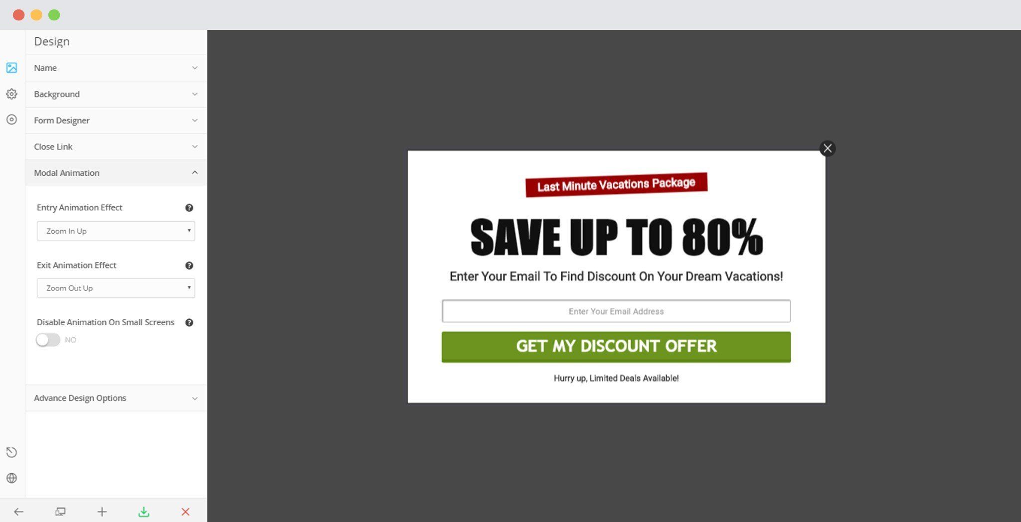
8. Animations for Modal Popups
ConvertPlus lets you add around 85+ entry and exit animations to your modal popups. You can set them by going to Designs -> Modal Animations